Maxisport Čerin
A retail interior design project for a company Maxisport Čerin, whose business is distribution and maintenance of bicycles, was planned by the Prostornina team. The partial renovation included replacement of the flooring, carefully planned custom-made furnishing and developing the concept for the store. The room illumination has been adjusted, however, the installations have remained largely unchanged.
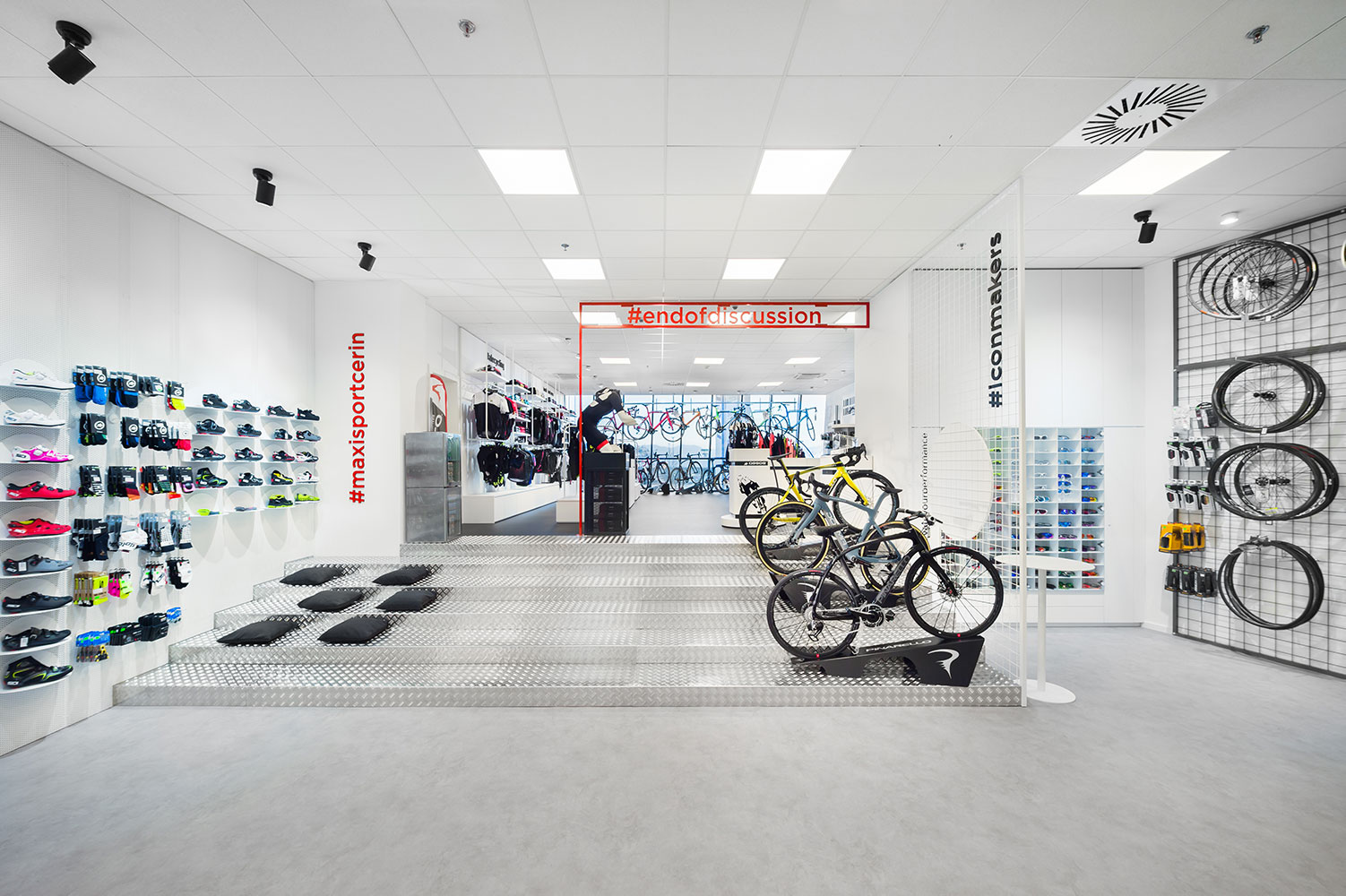
The specialised store offers the most modern cycling equipment, and its customers are amateur and professional top cyclists who require professional help and excellent service. The interior, store furnishing and the placement of merchandise items can have a positive effect on sales, as well as on the well-being of customers and employees in the store. The store planning required the search for functional and aesthetic solutions along with quality execution. The space is designed in two levels, which are connected by a tribune, which opens and connects the entire shop. At the same time, customers can also use it to sit on it and try on shoes.
Retail interior design
Facility type: Public facilities
Client: Maxisport Čerin
Location: Ljubljana, Slovenia
Year: 2019
Surface area: 165 m2
Photographer: Janez Marolt
Interior design: Nina Galič inter. arch., Ana Jerše univ. dipl. inž. arh., Živa Lutman MFA Design
-
Save
The main guideline in the store interior design was to create a cosy, bright and comfortable space where customers can also stay for a longer period. Inspiration was found in the shapes and materials that are typical for the cycling industry. Metal and modern clean shapes predominate, and the floor is covered with epoxy flooring to give a look of concrete. The clean and elegant interior was achieved by choosing bright exhibition elements in a white monochromatic colour scale, while red details, colour product displays and merchandise stand out in the space and create a pleasant contrast. The red colour is taken from the visual identity of the company.
-
Save
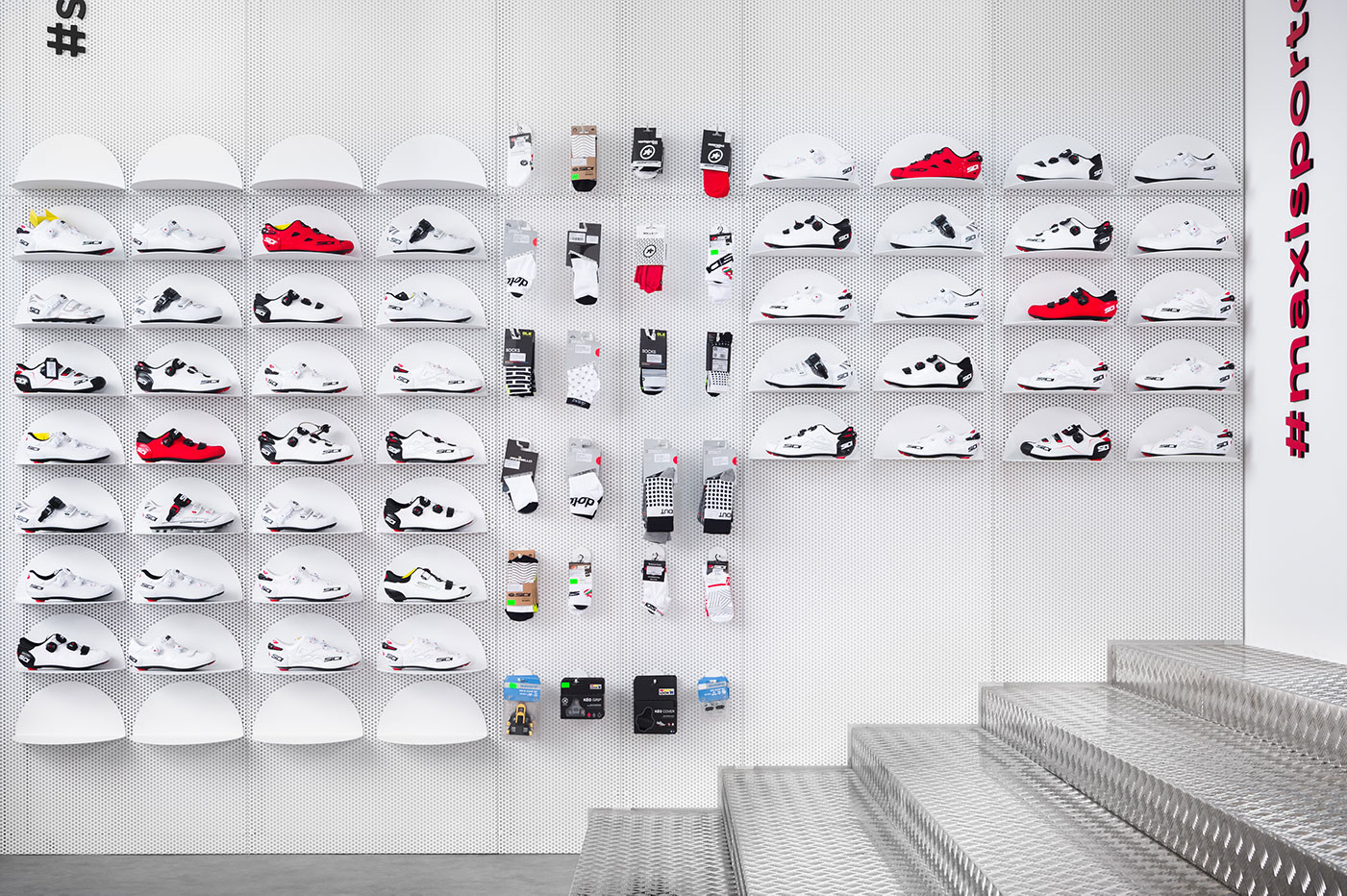
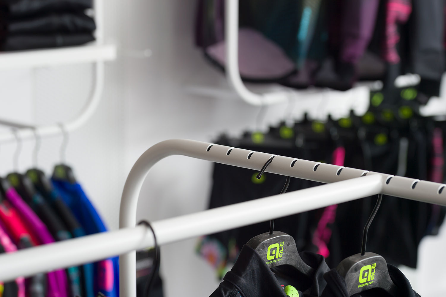
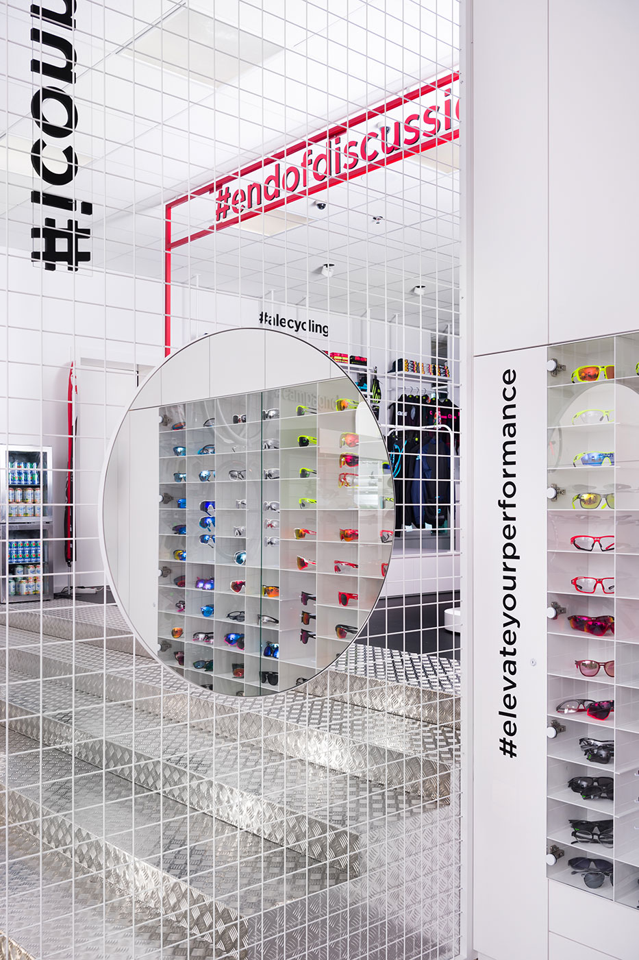
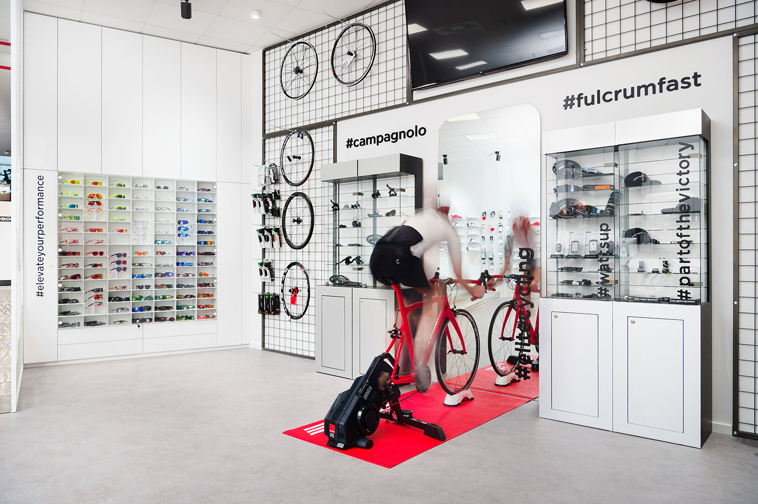
The room white illumination and flexible exhibition areas enable a good display of sales items. Perforated walls and metal nets allow any arrangement of hangers and shelves according to the changing sales program and collections. The clothes on the hangers are displayed in a clear and colourful order to stand out from the bright interior. The exhibited bicycles in the glazing facade hang from the ceiling, and the additional lighting enables a good and visible presentation of the products in the window display even at night and from afar.
-
Save
GUIDELINES IN THE RETAIL INTERIOR DESIGN
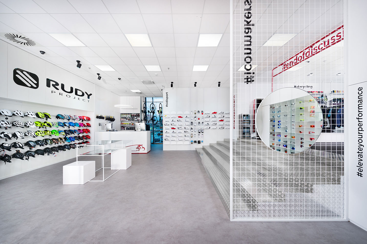
When planning the store, interior designers also paid big attention to individual brands and their guidelines in the retail space interior design. Some brands have their own exhibition furniture elements, a certain colour palette and rules for the placement of exhibition elements and merchandise in the shop, which must be followed.
-
Save
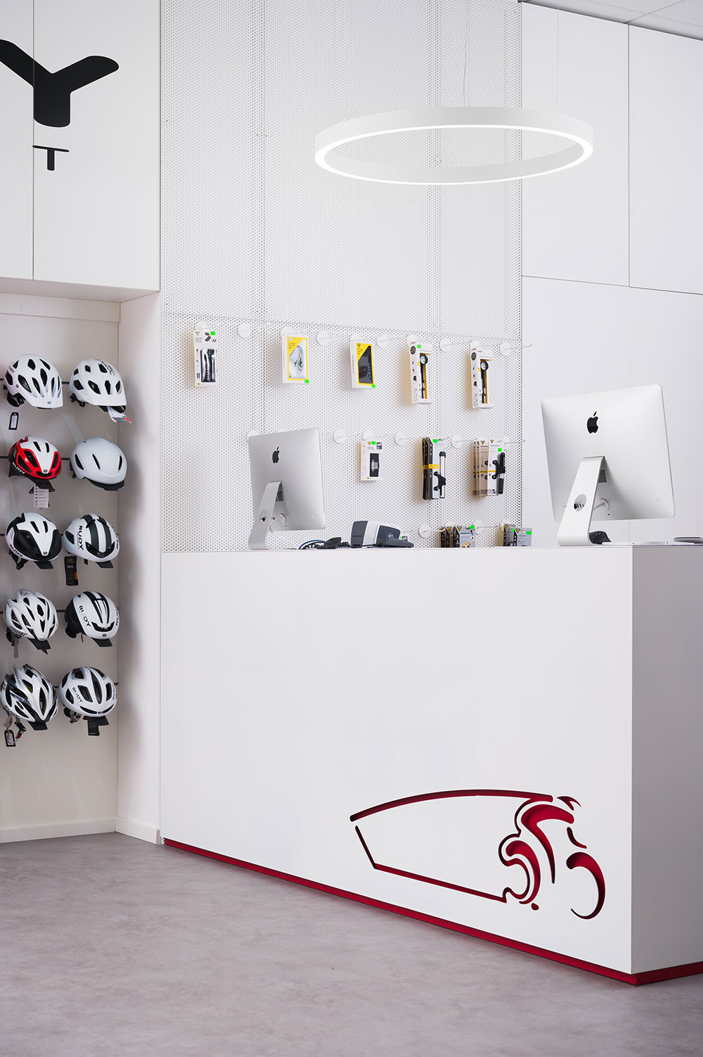
Attention is drawn to a custom-made metal sales counter with a red laser-cut logo and an interesting hanging ceiling light. An interesting and repetitive element in the space are also the captions of the most searched keywords or hashtags of individual brands, which have strong support and use among followers on social networks and thus replace their names.
-
Save
-
Save
-
Save
Contractors
Carpentry: MPles
Flooring: Ekostil
Metal constructions: Lesnina OK
Electrical installations: Litus Invest
Lighting: TEMS-US, Intra Lighting
Stickers: Promotor
Construction works: VI-FAS
Painting services: Jure Koljančič s.p.